Professional Website - Final Product
https://kylenoble303.wixsite.com/kylenoblemedia
These screenshots are of my final design for my website which has been published using Wix.
This is the final product of my HOME page. I still chose to use the same colour scheme as my rough edits, which keeps the website looking simple but effective. I also chose to have a boarder at the bottom of each page, just to add a little bit more colour and keep everything flush. Two photos which I am proud of, I decided to have in the home page of the website to break things up from being solely just videos. So, I have included two photos and 2 videos for people to view as they please, one being a short project and the other being my improved show reel.
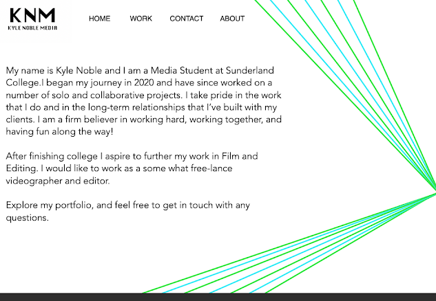
With having the coloured lines that span from one side of the website, I think it helps add more depth to the website while taking up blank space and making the website more vibrant. The text font I used, I wanted to be similar or matching to the text used for the navigation buttons.
I made each page as similar to one another as possible with the coloured lines adding more depth and colour to the page. As I only have a handful of video project's which I could show, I have two them on the WORK page and one on the HOME page. The videos are embedded in the website so you can either watch the videos on the website or on YouTube using the link provided when pressing on the videos. Just to add a little more variety while also filling up some blank space, I included another photo which I had taken and edited. I included a quick description for the two videos and also the photo.
I knew that the CONTACT page would be very plain and simple, but that is how I wanted it to be before designing the pages. All I wanted to include was my name, my job title so to say, my college email and a phone number but not a real one (using /// to resemble the numbers).
I gathered some feedback on my website to see where I could improve on areas of my website.
From the feedback I received on my website, I have gathered that there aren't many improvements that need to be made to make the website better. The small improvements that I will make are adding more detail to the ABOUT page by saying what my future ambitions are and what I would like to do after finishing college. And also adding some more detail to the descriptions of my videos that I have made.These are the small changes I have made to the WORK page, by adding some more detail into the descriptions of both videos. The small change in detail helps give the reader a little more understanding of the video before watching.
Taking on some of the feedback I received, I added some more detail to the ABOUT page of my website. I have added some detail of what I would like to do after leaving college which was said in the feedback responses. By adding just that small detail makes a big change to the ABOUT page as it lets people know my future ambitions in this area of work.


Comments
Post a Comment