Website Designs - Rough Edits
I have worked on rough edits for how I would like my website to laid out. I want to have 4 pages being Home, Work, Contact and About.
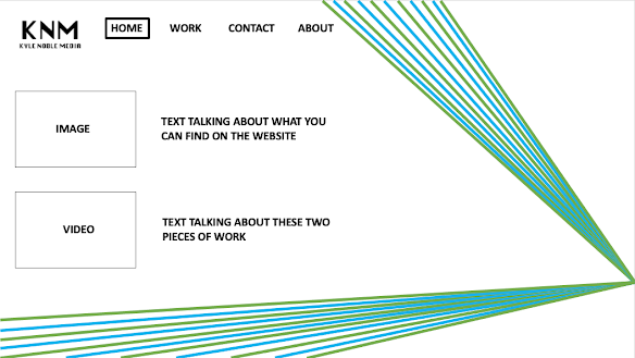
This is the rough design that I have for my Home page of the website. I have places my logo in the top left corner aside where the buttons will be to direct you to the other pages. When on any of the pages, I want the buttons to have an outline to show which page you are on. The colour scheme of the website, I have chose it to be the same as one of the business car designs I made with the colours being blue, green. white and black. Since I don't want the website to be bland, I have used the same sort of style that I used for my business cards with the coloured lines which span across the screen from one point. Personally I think that using the same type of design/layout as my business cards will help make the website stand out that little bit more while also having continuity with my other designs. I will change the text font when creating the website, but for the edits i have just used the PowerPoint automatic text font, 'Calibri (Body)'.
On each page I want people to be able to scroll down and see more images and videos, and this would make the website seem less messy by spacing out everything better. I do want to have the videos embedded so people can choose whether to watch it or not, or choose between while scrolling through. I also want the text to stay in the same place when scrolling through the website, keeping everything flush and neat.


Comments
Post a Comment